These days, most of the car ads that you’ll see will show off the car’s capability. Everything will be there, from its luxurious interior to cutting-edge technology and exterior looks. On top of that, there might be a beautiful model endorsing it. These are the primary attributes you can expect. If you honestly study it, you can call it artful deception.
The ads we see these days are unimaginably different from the car ads that used to run in past decades. These are the kind of ads people would actually sit and study in old magazines and newspapers. The most significant element of difference is the humor, which was at a whole new level in vintage car ads.
Not only were these ads funny, but they were equally educational. It’s a great marketing move. So, here are 41 highly creative and hilarious vintage car ads!
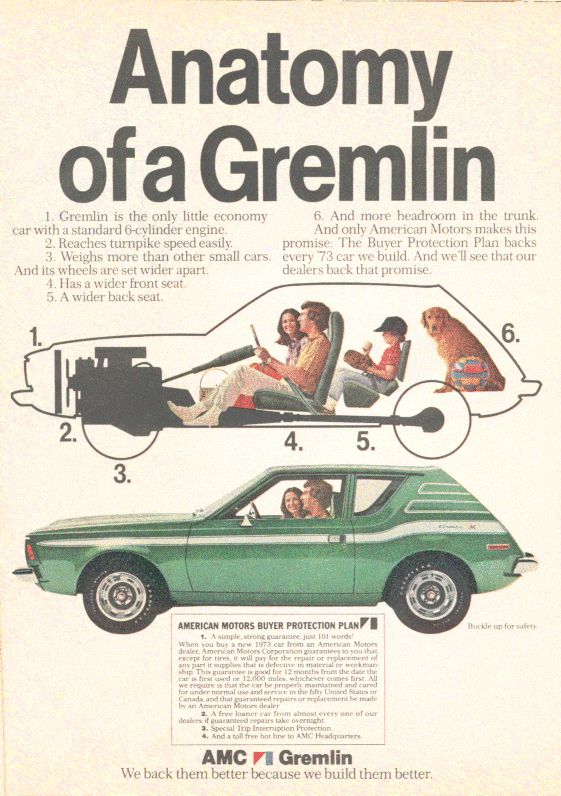
What’s gremlin anatomy?
Well, we’re honestly asking this question, and not in a funny way. We never learned about it in high school. Did any of you happen to study it in your textbooks? If you do know about it, please consider helping us out!

Phew, thankfully, that’s just the name of the car. Anyways, isn’t it a pretty small car? Also, we wonder how a doggo would feel sitting in that place, as shown in the image. Well, it still has some pretty impressive specifications, though.
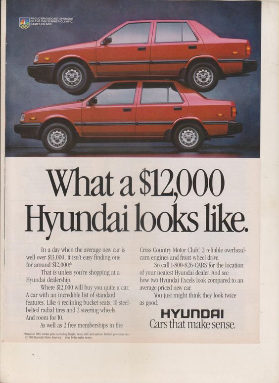
The best offer you can get
If you only read the headline and the image, it’d look like you’re getting two cars with one on top of the other for that sum, which would be pretty weird. But, they’re saying that you’re getting the features of two cars for the price of one.

These cars do make sense if you look at them properly and read the whole add. If you read everything, you’ll understand what they’re offering and how they’re offering. After that, you’d be in awe because that’s some excellent marketing right there.


